got ethical husbandry?

BAR Banner

robert4025

Neptune Aquatics
LFS Owner
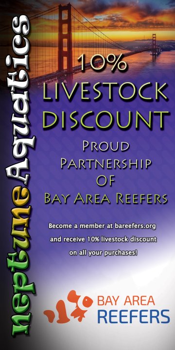
So, here’s the first cut of the banner my brother did. What do you guys think?

#1
neptune display banner - bar discount - vertical.jpeg
 
Last edited:
Is the discount only on livestock? Or everything? Language is confusing IMO…

Are we called “Bay Area Reefers” or “the Bay Area Reefers Club”?
 
I’d delete the language under the 10% Livestock Discount, i.e. “on all your purchase”.

And isn’t the discount only for supporting members, and not just any member? Shouldn’t that be a bit more clear?

I’d change the text at the bottom to, “In proud partnership with Bay Area Reefers”

My 2cents. Which ever way this land, thanks for putting the banner up at the store. Great initiative!
 
Why? The discount applies to every purchases as long as the purchased item(s) is live-stock and not dry goods. Otherwise people would think it’s just a one time discount.

Overall I think the banner looks good!

Maybe go with, Just [Supporting (Bar) members receive a 10% discount on Livestock Purchases]

**Purchases being plural implies more than one purchase


I think the nano reefer was attempting to say its a little too wordy
 
This is fantastic Robert! I agree with some of the suggestions about clarifying a little- maybe work with Thomas or Bruce or Eric on it directly?. But overall I’m super excited about getting this done and hanging!
 
I actually would do the other way and be more ambiguous on the banner, and reorder it to emphasize the club over the discount.

-----
Sideways Neptune Aquatics.

Top (big text): Proud partner of Bay Area Reef club. (Big text)
BAR logo

Members receive ongoing advice and purchase benefits.

------

Makes it less about the discount and more about the other stuff. Avoids having to reprint if the discount changes. Avoids people thinking about why all prices aren't 10% off for everyone. Gets them to either ask questions out loud letting them build a small relationship with the employee or go online and see the website if they want to know what the benefits are. Also makes people think there's more to it than mentioning they're a member, despite there being no verification that they are one.

Getting into the details of supporting members versus non supporting and what not seems better to do on a website than bloating a banner. Especially given there's no real enforcement of it anyway.
Nailed it, IMO.
 
This is a fantastic benefit to BAR @robert4025 ! Thanks for doing this.

I think what @richiev mentioned are very good points to consider.

I'd love to see your logo and the BAR logo together at the very top. It visually expresses unity and it shows off your brand most importantly. At the end of the day, we want our members shopping proudly with our partners. NOT because of the discount.

I'd loose the GG bridge image in the background or if you insist on keeping it, adjust the transparency. If you decide to remove it, a uniform blurred abstract or even a faded reef background would still look great. The logos and words would bounce off the banner.
 
Back
Top