Neptune Aquatics

New Website Style Available

I had some time over the weekend (when I wasn't scrubbing algae off my live rocks) to add a new "style" to the website for testing. I've been using it a few days on various devices and it seems good. There are numerous visual improvements and, IMO, improved navigation.

Items to note that are not quite finished:
  1. The logo is temporary. I just did a quick update to make it fit the size and layout of the style.
  2. The style still needs some adjusting and tweaking.
  3. DBTC pages will display with the old style for the time being. I've not had time to figure out a way to make those switch without switching them for everyone.
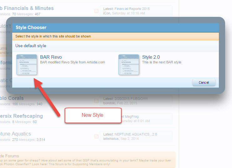
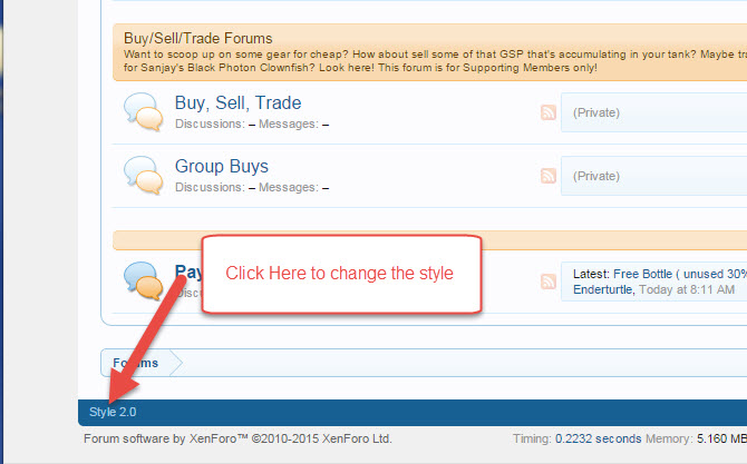
If anyone is inclined to use the new style, you can activate it using the link in the bottom left had side of any page on the site. Let me know your thoughts on the new look, layout, and features here in this thread. Also, please let me know if you encounter any bugs.

style_stepone.jpg


style_steptwo.jpg
 
Im liking this new style. The color coding for active threads is a nice way to quickly see which threads are active.

I like the color style of the layout. Looks very nice when browsing on my phone too.

Forgot to mention that! The new style is responsive, so the layout adjusts automatically when you are browsing from your phone or tablet. It also uses fonts that are retina display compatible.
 
I will give it a try and report anything unusual....

I am really liking the new layout...

Thank You Philip for your time and effort on this
 
Last edited:
The only suggestion I have so far in regard to the new web-sight design (BTW...I like it a lot better...good job on it.)..... is that when I am logged in the blue banner at the top of the screen as you scroll up and down will hide the new post logo on the top right corner in a forum that so I have been having too click on a Forum that has a new post and scroll up to see if that was a new post or not.....I am sure this sound petty and not sure if anything can be done about it, but was just giving feedback

Here are some pics so you can see how Coral reefer posted something new but the blue top banner hides that it was new and also hides his comment and the second picture you can see it I scroll up you can see its new...I have missed some posts this way.

I was using the current version of Fire Fox and Chrome

If you look closely you can see the orange "NEW" logo under the blue banner where I circled it....
Capture.PNG


After I scroll Up....

Capture1.PNG
 
The only suggestion I have so far in regard to the new web-sight design (BTW...I like it a lot better...good job on it.)..... is that when I am logged in the blue banner at the top of the screen as you scroll up and down will hide the new post logo on the top right corner in a forum that so I have been having too click on a Forum that has a new post and scroll up to see if that was a new post or not.....I am sure this sound petty and not sure if anything can be done about it, but was just giving feedback]

Thanks for the feedback. I'm not sure how much I can adjust the blue banner at the top. I think the intent is that the blue stripe is in front and the webpage scrolls behind it. When browsing using Chrome, the banner is slightly transparent, but it looks less so in your examples. When I have some time, I'll tinker around with it and see if I can adjust the settings a bit to make it a little clearer and a little easier to read the actual page...
 
Thanks for the feedback. I'm not sure how much I can adjust the blue banner at the top. I think the intent is that the blue stripe is in front and the webpage scrolls behind it. When browsing using Chrome, the banner is slightly transparent, but it looks less so in your examples. When I have some time, I'll tinker around with it and see if I can adjust the settings a bit to make it a little clearer and a little easier to read the actual page...

I totally get if you cant just was letting you know of my experience...and I appreciate your time looking into it....
 
Not sure if its just me but I feel there should be a max-width set for content area. That way content is fluid and responsive as you scale down but after a specific width scaling up, the content area stays fixed and centered to the browser.

Its a user experience best practice to limit the width of textual content to 650-800px for better readability. If you look at popular news sites like www.mashable.com you'll see what I mean. Just my opinion :)
 
I have notice that threads that I click on that has new post it wont go to the bottom newest post if it has pictures in the thread it stops on a picture...and there is no rhyme or reason which picture...its not the first pic or the last...???
 
Not sure if its just me but I feel there should be a max-width set for content area. That way content is fluid and responsive as you scale down but after a specific width scaling up, the content area stays fixed and centered to the browser.

Its a user experience best practice to limit the width of textual content to 650-800px for better readability. If you look at popular news sites like www.mashable.com you'll see what I mean. Just my opinion :)
Yeah, I think I had originally built the last default theme that way since there are still a lot of folks with pretty old displays with smaller resolutions. However, this is a pretty responsive design that seems to appeal highly to most of us so far. However, you are the UI expert after all, Nav. ;)
 
I agree with being responsive as we scale down the browser. When the browser gets larger, its no more responsive, its fluid... Responsiveness going big could involve a change in layout where there's a mater-detail view of threads in a forum to the left and one active thread with conversations to the right. I think thats too much effort & thats why suggested doing a max-width for the container. Maybe like 1000px...

See difference in screenshots here.

Screen Shot 2015-03-25 at 8.15.51 AM.png


Screen Shot 2015-03-25 at 8.10.04 AM.png
 
I really like how the content expands and contracts to fit the screen. Looks great on my iPhone 6 too.

But I do kinda agree with Nav. Not sure if it's just me but I feel like it's a bit strenuous on my eyes having to read a sentence from one side of my wide screen monitor to the other end of the monitor.

Nano reef has a fixed width.
Reefcentral is similar to us, their forum expands across the monitor BUT their Username/avatar panel is wider which makes the width of the text content slightly narrower.

My 2 cents. Y'all are doing great :)
 
I'm for putting a max width/margin also.

This will have to be modified in the CSS style sheet unless this style has some front end attached to it.

If there aren't any instructions, it would be best to contact the author of the style sheet, if not, we can experiment on the test server.
Style sheets really suck to modify in XenForo if you're not careful or know how things are structured--there is little documentation.
 
Alfred, its pretty straight forward... find the theme's CSS file and update this style definition (bold is what has to be added)
:)
#content .pageContent {
zoom: 1;
max-width: 1000px; /* to limit width */
margin: 0 auto; /* to center the content */
}
 
Back
Top