Welcome to BAR - the Bay Area's premier saltwater hobbyists hub!

LED in Photos...

Guest
Joined
Oct 19, 2012
Messages
1,116
Hi Gang,

Thought I'd share with you one of my most recent projects. I was commissioned to create the product photos for one of Reef Radiance's LED fixtures and here's what I came up with, what do you think?

_MG_9630And8more-Edit.jpg

_MG_9668.jpg

9651%20amp%209656.jpg
 
Guest
Joined
Apr 10, 2014
Messages
2,912
Amazing FIdel! Absolutely beautiful.

Very clear I dont even know how you can get such sharp pictures.


Rick needed these pictures so much.
 
Supporting Member
Joined
Nov 7, 2005
Messages
17,384
I have no idea what makes a "good" photo, but it looks good to me :) I especially like the top picture with the actual colors of the LEDs so you can actually see the difference between the violets, blues and royal blues, where as normally you can't tell because the actual LED die does not look the same color (except for red)
 
Guest
Joined
Oct 19, 2012
Messages
1,116
Hey folks thank you all for the positive feedback, I enjoyed shooting these photos and soon I'll have more to show :)
 
Guest
Joined
Sep 20, 2013
Messages
242
Very nice shots indeed. My only real comments are on the last double pic and their very small compositional type things. The yellow cat5 cord clashes with both the orange of the apex and the yellow of their fans so if it's not something that comes with the light I would swap it with another color. The dials in the bottom pic are at an odd angle compared to the rest of your lines and are drawing a little focus and lastly I would remove the white stickers, shouldn't be hard to do in post especially considering your lighting looks impeccable. There's my 2c


Sent from my iPhone using Tapatalk
 
Supporting Member
Joined
Jun 29, 2010
Messages
7,114
How the heck did you get rid of the LED glare on the first shot? That is amazing.
Although so amazing, it almost appears a bit fake. Hope people don't think that.

Hmm, I like the yellow cord + yellow fans.

Funny: The product itself seems to have a lettering issue.
The knobs and the stickers are oriented one way, but the white print for reset
and the other word partly covered up are the other way.
 
Guest
Joined
Oct 19, 2012
Messages
1,116
Hi folks, sorry about the delay I was out of town most of the week.

I love these comments, allowed me to analyze the photos differently :)

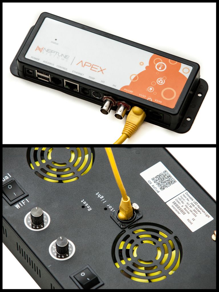
Merith - This sample had to go back on the shelf and considering that the QR sticker is needed to download the app for controlling the unit, I chose against removing any stickers before the end user received it. The color was chosen for uniformity, had it been blue it would draw from the whole thing altogether and though the illustration was created strictly to display the apex compatibility, the presentation of the product itself is still priority so yellow complimented the fans on the fixture. As to the Apex, that is a whole other brand and product completely so their choice in colors doesn't dictate how this fixture should be presented.

Funny thing about the stickers & writing opposing each other, I stood there for 5 minutes wondering why? in any case I should have probably framed the photo differently to avoid showing a closeup of this discrepancy.

Mark - sharpness/clarity is not difficult with a few tricks, I employ the use of a beefy tripod/head, remote trigger and mirror lockup (along sharpening in post). Basically everything you can do with an SLR to eliminate vibration. This specifically is why I am absolutely in love with shooting city & landscapes:D
 
Last edited:
Top